There is a version of this story where a studio brags about moving quickly and leaves it there. That version is useless. Seven days only sounds impressive if the work still feels composed at the end of it.
The real starting point was not design
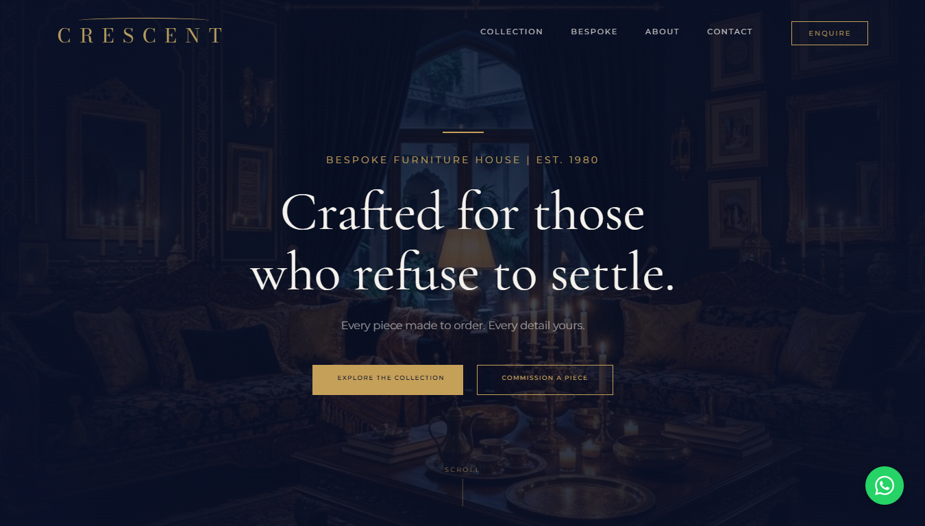
When a business has been operating on reputation and referrals for decades, the first problem is rarely colour or layout. It is translation. You have to translate a real-world reputation into a digital first impression that does not flatten the business into another generic website.
For Crescent, that meant getting clear on the tone before anything else. It needed to feel established, premium, and internationally legible. Not loud. Not trendy. Not overdecorated. Just assured. The kind of site that lets the work breathe and makes a visitor believe there is substance behind the visuals.
Speed only worked because decisions were made early
The reason the timeline held was not because the build was chaotic. It was the opposite. The direction became clear quickly, and once that happened the work moved in one line instead of five competing ones. Copy, hierarchy, page structure, and design all started reinforcing the same positioning.
That is the hidden part of most rushed projects. They do not fail because the designer was slow. They fail because the business never decided what the site was supposed to say in the first place. Then everybody burns time trying to solve uncertainty with more revisions.
Here, the message was simple: Crescent is not a catalogue dump. It is a furniture house with history, taste, and enough seriousness to justify a premium digital presence. Once that sentence became clear, everything else got easier.
Small websites still carry a lot of weight
A six-page website sounds small until you remember what those pages are being asked to do. They have to establish taste, make the brand feel trustworthy, guide the visitor, handle enquiries cleanly, and avoid the dead feel that comes from stock agency layouts.
That is why I do not really think in page-count terms. I think in tension. How much does this business need the site to communicate in a very short amount of time? In Crescent's case, the answer was quite a lot. The site needed to say heritage without looking old, quality without sounding inflated, and ambition without pretending to be something it was not.
The launch mattered because it changed the proof layer
For AH Studio, this project was important for another reason. It became live proof. Not a concept, not a placeholder, not a claim typed onto a homepage. A real client, a real domain, and a real business trusting the studio to represent them publicly.
That changes the way prospects read the entire site. They no longer have to imagine whether the work can hold up in the real world. They can click and see it.
If you want the fuller breakdown, the case study is here. If you want the live result, the launch is documented here and on the Work page.
What this project proved
The biggest lesson is not that seven-day launches are inherently good. The lesson is that speed becomes believable when the thinking is disciplined. If the positioning is right, if the design is restrained, and if the build does not collapse under its own ambition, a short timeline can feel sharp instead of reckless.
Crescent needed a digital presence that felt like it belonged to the business already. That was the standard. Hitting it quickly was the bonus.